
Design systems that are built in-house have become critical enablers for product and technology teams, heralding benefits including improved consistency, collaboration, and faster time to market. When done right, a proper design system can align diverse teams, drive reusability, build coherent digital experiences, and enable rapid high-fidelity prototyping.
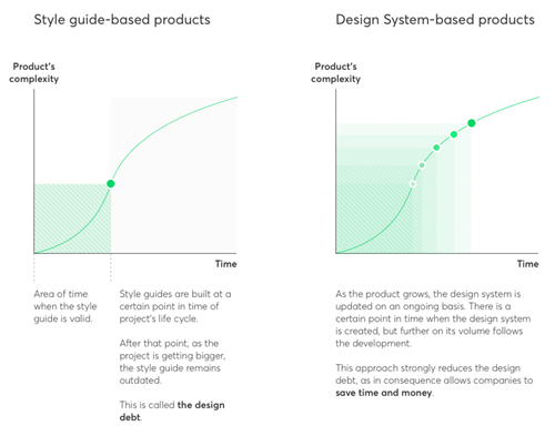
But with all the confusion around what a design system actually is, and where it sits in the value stream, most attempts at building one that supercharges efficiencies is easier said than done, and many of them tend to get abandoned when people realize how much effort there is into getting one ready from scratch. The vision of a fully realized design system then stops from being a single source of truth that will unify design, development, and product teams to realize a product to just a stylesheet deliverable.
The prime objective of a design system, as an enabler of teams, then stops being “What should I put into it?” and becoming one that answers the question of “Who is going to use it and how?” When we started in the absence of a solid framework, the key questions that needed to get answered were:
What is the purpose and what are the core design principles we wanted to follow at all costs?
How do we ensure consistency through a unified design language?
How do we enable teams to find and consume the components, patterns, and templates they need?
How do we ensure reusability, above all else?
Rather than build a design system on top of our current digital assets, through style guides, we started with an audit of the existing components, and what was usable and conformed to our design language and principles. The ones that made the cut ended up in an interim “holding pattern” style guide as we retooled from Pencil, Moqups, and Adobe XD to Figma, which allowed us to house the foundational elements of our design system.
Once we had identified and created the master components, we used the new Variants feature in Figma to spin out variations on a common master component, that could then be categorized into a component bucket and exported out to a central asset repository within Figma. And as part of the streamline, the processes that vetted the merging of these assets into the central repository were overhauled to ensure that the components adhered to the new design language as well as the functional and perceptual patterns outlined in the design system.
As each product designer worked with the product teams to envision new products and features, they were forced to evaluate their assets against the design language and existing components, to ensure that no one deviated from the agreed language and that perhaps, more than any other change, was the hardest and made all the difference.
With the bare foundations of a design system in place, the challenge then was to facilitate handoffs to the front-end developers, who would be responsible for bringing the designs to life through code. With Figma’s Developer Handoff feature, all assets and point-of-reference design files were delivered through Figma for implementation, allowing developers to inspect the components and pick up CSS implementation properties.
With the handoffs in place, the challenge then became exposing these to other designers, product teams, and developers in a way that transformed the asset library into a more functional design system through documentation, best practices, and code snippets that would allow product and development teams guidance on what should be used, when and how.
In the next part, we will be covering using more tools and systems to expand other teams to view and consume the design system as well as the front-end code.
Author: Krishnan Rajagopal