In times of market uncertainty, staying updated on daily changes is vital. With markets moving dramatically within a single day, having access to up-to-date and reliable data is imperative so you always have an accurate picture on performance and can understand how your clients’ portfolios are affected.
In this blog we look at ways in which FE Analytics can help you monitor fast moving market changes and understand the impact on your investment proposition.
Our dedicated pricing and data teams ensure that our pricing information is up to date and reflected in FE Analytics, so you can ensure you are analysing reliable fund data at all times.
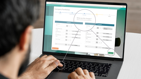
There are several charts in FE Analytics that can help you report daily on performance changes and market movements and below we are going to look at some of them in detail.
Performance line charts can be run over time periods as little as a month, which means you can report on the relative performance of your clients’ funds or portfolios and their benchmark(s), giving vital up to date context. You can even add a date marker to clearly show the performance of the selected investments at key moments relative to their benchmark.
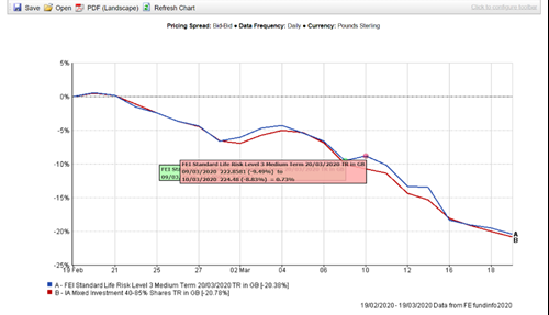
In the above chart, we can see that the portfolio has fallen over the selected time period. However, there are also days where it has risen slightly, which is more evident as we are looking at data is updated on a regular basis.
Comparing performance over contrasting time periods
While having an accurate picture of short-term market movements is good, thinking longer term and seeing the bigger picture is also important, both during times of volatile markets and in general. An easy way to emphasise the value of long-term investing is by showing multiple charts in the same window, as seen below.
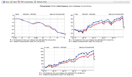
By comparing three different time horizons of the same portfolio, what might seem bleak in the first chart, can be seen with a bit more optimism when side by side.
In the first chart, we see that the investment has dropped 20% from the end of February to and the first few weeks of March. However, when we compare it to the two other charts, where the time scale is five and ten years respectively, we see that the portfolio and the benchmark are still in the black, highlighting the importance of investing for the long-term.
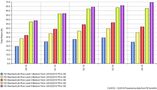
Rolling period bar charts are another way to compare performance based on longer term intervals, rather than the unique conditions of recent times.
In this example, when looking at performance over the last six months in discrete terms, all five portfolios shown here appear to have underperformed over this period, whichever the level of risk they have taken on.
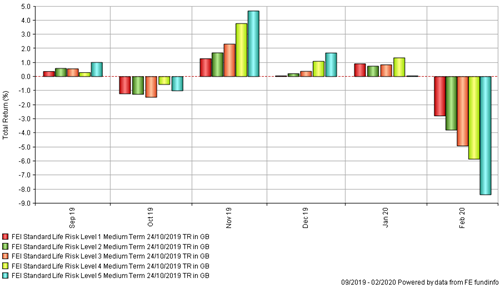
However, comparing this against rolling five-year return periods (concluding at quarter end points), it highlights the importance of longer term investment time horizons, rather than interpreting the data based entirely on short-term market conditions.
For you to access current and up-to-date data at any given time, FE Analytics is backed by our enriched fund data collection with thousands of data points updated daily. We collect, validate and disseminate data across a range of data vendors, platforms, third party distributors and back office software providers. Our databases are constantly being updated as we process over 4 million prices, 300.000 documents and 1.5 million fields of data every month. That way we can provide you with quality, timely and accurate data that can help you make better investment decisions for your client.
FE Analytics is a one-stop shop for all your investment research and analysis, portfolio construction, due diligence and ongoing monitoring.